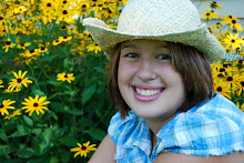
I would brighten the background on the original, but not the face, I think her skin and eyes look better on the original, but that's just me. Great shot, beautiful girl.
First of all great shot! I think the straight out of the camera shot is really nice. Great light, beautiful girl, clear skin, so not much editing is really needed. Your edited version turned her a little orange and changed her hair color. Looks like you might have done a little too much sharpening?
I think all you need to do is slightly sharpen the image, then zoom in to sharpen her eyes a little more. If you have Photoshop, I'd recommend trying Pioneer Woman's free "bring out the eyes" action.
It's a good thing when that's all someone needs to recommend:-)
Have a great weekend, Amy Co-Founder I Heart Faces
I am no professional so take my advice for what it is, but I think I would go back to the original, boost only the background and keep the girl's skin the color it is. I would probably then try to smooth it out and fix any imperfections. Her eyes are already gorgeous so I would probably leave them alone (you wouldn't want to overdo them).
I love this photo. The vibrant colors behind her really makes the picture. (Not to mention that she is beautiful!) I prefer a photo that's a little less contrasty and perhaps slightly less warm. Although, I did up the contrast, I tried to contain myself. (I'm not sure I was successful.) In my version, I adjusted the levels and curves, cleaned up the stray hairs with the healing brush, sharpened the eyes, reduced the noise and sharpened the photo up overall. Here's my interpretation: http://rileyyearinphotos.blogspot.com/2009/10/fix-it-friday.html
Ah, I just noticed you're 19. Yep, if you're like I was way back when, you're probably broke. :) CS4 may be out of the picture for you, but keep in mind that college students get a substantial discount. Through my college, Photoshop is $199. I just recently bought it. Up until then, I used Elements exclusively. One nice thing about Elements is that an older version can be snagged for pretty cheap, and it gives you a great introduction into layers, masks, etc. Also, I use a community version of Noiseware which is FREE! It works separate of any editing program. Kind of a pain for me, but it still does a great job. Just from this picture alone, I can tell that you have a future in photography. I wish you all the best!
Your sooc is fantastic. I love the composition, and the wall. I see from the comments you are just starting out. What editing program did you use? You can use Picasa, which is free. I would suggest calibrating your monitor and checking the brightness on your monitor as soon as possible. You'll probably have to pick either Photoshop Elements for about $100 or a monitor calibration kit such as the Pantone Huey for about $100. Frankly, you can't use Photoshop to its full potential if you are not sure about the colors and brightness you are seeing. So I'd personally go for the calibration, then the software.
For software you can use Picasa. Here's a quick edit of your sooc. Like I said before, your sooc is fantastic. Exactly what you want to see. And the newest version of Picasa has a histogram available so you know (even if you aren't calibrated) if you're blowing the highlights or the red channel in post.
Oh, cool! You are using a point and shoot. Seriously you have some talent. Your settings are: shutter 1/125 | f/3.2 | focal length 14.8. I'm not sure of the ISO, but with the lack of noise probably pretty low. I've heard good things about the Canon Powershot.
Let's talk about that focal length. That is a very wide focal length which leads me to believe you were standing pretty close to her. Next time try stepping back and zooming in to the other end of the focal range. What you will accomplish is compressing the background so that the subject pops out even more. Next, use the portrait setting. Using the portrait setting will make sure the camera chooses the lowest available aperture for the shot. That's what gets you the blurry background. So in two simple steps you've compressed the background and blurred the background. Professionals regularly use a 200mm lens for portrait photography.
Now about post processing. In Picasa I would click the tuning tab and click the magic wand next to the neutral color picker. That took some of the red out. Bring the fill light up just a little bit. Watch your blue channel on the histogram. It's trying to blow really fast. You don't want it to climb the right hand "wall." Highlights up just a smidgen. And deepen the shadows until that blue channel comes down off the wall, LOL.
Then go to effects and sharpen at just below that half way mark. You can play with that slider and see what oversharpening gets you. Crunchy hair!
Here's that edit: http://i7.photobucket.com/albums/y286/NanasMama/tessy-47editpicasa.jpg
Thank you so much for joining in this weekend. I hope some of what I said helps. I love photography, too :).


I would brighten the background on the original, but not the face, I think her skin and eyes look better on the original, but that's just me. Great shot, beautiful girl.
ReplyDeleteFirst of all great shot! I think the straight out of the camera shot is really nice. Great light, beautiful girl, clear skin, so not much editing is really needed. Your edited version turned her a little orange and changed her hair color. Looks like you might have done a little too much sharpening?
ReplyDeleteI think all you need to do is slightly sharpen the image, then zoom in to sharpen her eyes a little more. If you have Photoshop, I'd recommend trying Pioneer Woman's free "bring out the eyes" action.
It's a good thing when that's all someone needs to recommend:-)
Have a great weekend,
Amy
Co-Founder
I Heart Faces
I would have to say I prefer the original. The second her eyes are too dark. Great photo
ReplyDeleteI am no professional so take my advice for what it is, but I think I would go back to the original, boost only the background and keep the girl's skin the color it is. I would probably then try to smooth it out and fix any imperfections. Her eyes are already gorgeous so I would probably leave them alone (you wouldn't want to overdo them).
ReplyDeleteI messed around with it a little bit. Like I said before, I am no professional but I would have done something like this.
ReplyDeletehttp://3.bp.blogspot.com/_damiaPP9FW8/SsZGRthAsHI/AAAAAAAAARg/WnKFcTAwoFk/s1600/beforeafter6.jpg
I love this photo. The vibrant colors behind her really makes the picture. (Not to mention that she is beautiful!) I prefer a photo that's a little less contrasty and perhaps slightly less warm. Although, I did up the contrast, I tried to contain myself. (I'm not sure I was successful.) In my version, I adjusted the levels and curves, cleaned up the stray hairs with the healing brush, sharpened the eyes, reduced the noise and sharpened the photo up overall. Here's my interpretation: http://rileyyearinphotos.blogspot.com/2009/10/fix-it-friday.html
ReplyDeleteAh, I just noticed you're 19. Yep, if you're like I was way back when, you're probably broke. :) CS4 may be out of the picture for you, but keep in mind that college students get a substantial discount. Through my college, Photoshop is $199. I just recently bought it. Up until then, I used Elements exclusively. One nice thing about Elements is that an older version can be snagged for pretty cheap, and it gives you a great introduction into layers, masks, etc. Also, I use a community version of Noiseware which is FREE! It works separate of any editing program. Kind of a pain for me, but it still does a great job. Just from this picture alone, I can tell that you have a future in photography. I wish you all the best!
ReplyDeleteYour sooc is fantastic. I love the composition, and the wall. I see from the comments you are just starting out. What editing program did you use? You can use Picasa, which is free. I would suggest calibrating your monitor and checking the brightness on your monitor as soon as possible. You'll probably have to pick either Photoshop Elements for about $100 or a monitor calibration kit such as the Pantone Huey for about $100. Frankly, you can't use Photoshop to its full potential if you are not sure about the colors and brightness you are seeing. So I'd personally go for the calibration, then the software.
ReplyDeleteFor software you can use Picasa. Here's a quick edit of your sooc. Like I said before, your sooc is fantastic. Exactly what you want to see. And the newest version of Picasa has a histogram available so you know (even if you aren't calibrated) if you're blowing the highlights or the red channel in post.
Oh, cool! You are using a point and shoot. Seriously you have some talent. Your settings are: shutter 1/125 | f/3.2 | focal length 14.8. I'm not sure of the ISO, but with the lack of noise probably pretty low. I've heard good things about the Canon Powershot.
Let's talk about that focal length. That is a very wide focal length which leads me to believe you were standing pretty close to her. Next time try stepping back and zooming in to the other end of the focal range. What you will accomplish is compressing the background so that the subject pops out even more. Next, use the portrait setting. Using the portrait setting will make sure the camera chooses the lowest available aperture for the shot. That's what gets you the blurry background. So in two simple steps you've compressed the background and blurred the background. Professionals regularly use a 200mm lens for portrait photography.
Now about post processing. In Picasa I would click the tuning tab and click the magic wand next to the neutral color picker. That took some of the red out. Bring the fill light up just a little bit. Watch your blue channel on the histogram. It's trying to blow really fast. You don't want it to climb the right hand "wall." Highlights up just a smidgen. And deepen the shadows until that blue channel comes down off the wall, LOL.
Then go to effects and sharpen at just below that half way mark. You can play with that slider and see what oversharpening gets you. Crunchy hair!
Here's that edit: http://i7.photobucket.com/albums/y286/NanasMama/tessy-47editpicasa.jpg
Thank you so much for joining in this weekend. I hope some of what I said helps. I love photography, too :).
Good luck on your journey!
Amanda
This really is such a great picture! I can see you have an eye for photography :) Keep up the great work!
ReplyDelete